Our mission was clear: redesign our product cards to create a more engaging, visually appealing, and streamlined experience. We aimed to simplify content for better accessibility while infusing boldness and vibrancy to align with a fresh, modern aesthetic.
Our mission was clear: redesign our product cards to create a more engaging, visually appealing, and streamlined experience. We aimed to simplify content for better accessibility while infusing boldness and vibrancy to align with a fresh, modern aesthetic.
Our mission was clear: redesign our product cards to create a more engaging, visually appealing, and streamlined experience. We aimed to simplify content for better accessibility while infusing boldness and vibrancy to align with a fresh, modern aesthetic.
Company
Chegg
Type
Product Design
Year
2020-2023
Team
Claire Fraze, Nancy Qian, and Chaella Dent
Analyzing existing designs
The first iteration began with an honest evaluation of the original product cards, which were composed mainly of screenshots directly pulled from the product interface. These cards, while functional, lacked design foresight and did not align well with the evolving brand identity. We recognized the need for a more strategic redesign, one that would streamline the information and elevate the overall design.
The first iteration began with an honest evaluation of the original product cards, which were composed mainly of screenshots directly pulled from the product interface. These cards, while functional, lacked design foresight and did not align well with the evolving brand identity. We recognized the need for a more strategic redesign, one that would streamline the information and elevate the overall design.
The first iteration began with an honest evaluation of the original product cards, which were composed mainly of screenshots directly pulled from the product interface. These cards, while functional, lacked design foresight and did not align well with the evolving brand identity. We recognized the need for a more strategic redesign, one that would streamline the information and elevate the overall design.

Updating aesthetic and functionality
In the second iteration, we took a bold approach by starting from scratch. After a thorough review of the initial cards, we identified the elements that worked and others that needed refinement. Introducing colors from our tertiary palette, we gave the cards a more vibrant, cohesive look while improving their versatility. The new design was not only visually captivating but also made the content clearer and more engaging, acting as an intuitive tool for users to better understand our product's features and values.
In the second iteration, we took a bold approach by starting from scratch. After a thorough review of the initial cards, we identified the elements that worked and others that needed refinement. Introducing colors from our tertiary palette, we gave the cards a more vibrant, cohesive look while improving their versatility. The new design was not only visually captivating but also made the content clearer and more engaging, acting as an intuitive tool for users to better understand our product's features and values.
In the second iteration, we took a bold approach by starting from scratch. After a thorough review of the initial cards, we identified the elements that worked and others that needed refinement. Introducing colors from our tertiary palette, we gave the cards a more vibrant, cohesive look while improving their versatility. The new design was not only visually captivating but also made the content clearer and more engaging, acting as an intuitive tool for users to better understand our product's features and values.
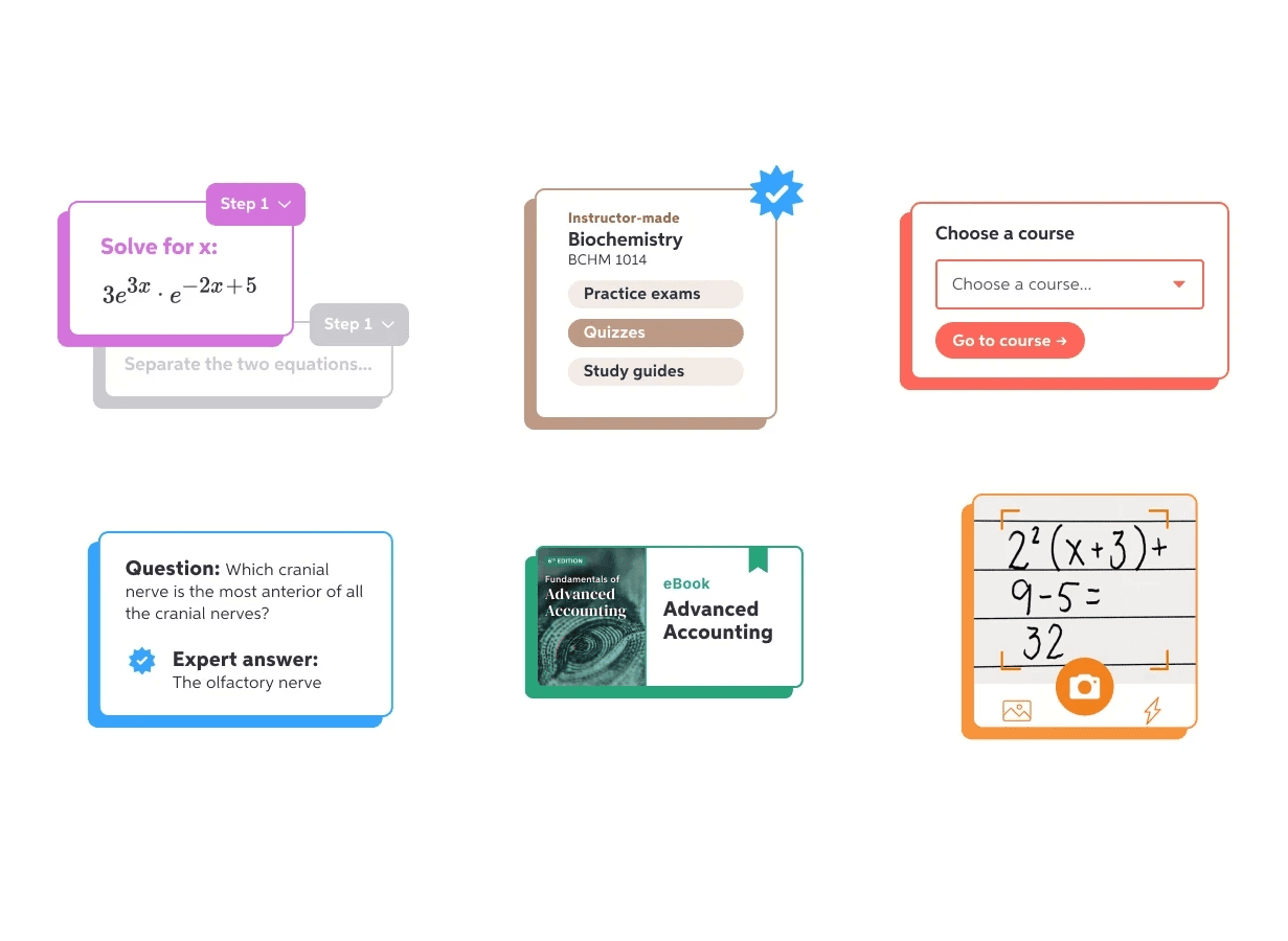


Refining for clarity
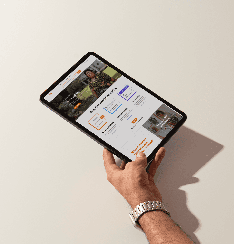
We embraced a minimalist design to allow the product’s value to shine through without distraction. Through this process, we also explored how the product cards could adapt across different touchpoints, ensuring consistency across various use cases while maintaining their visual impact.
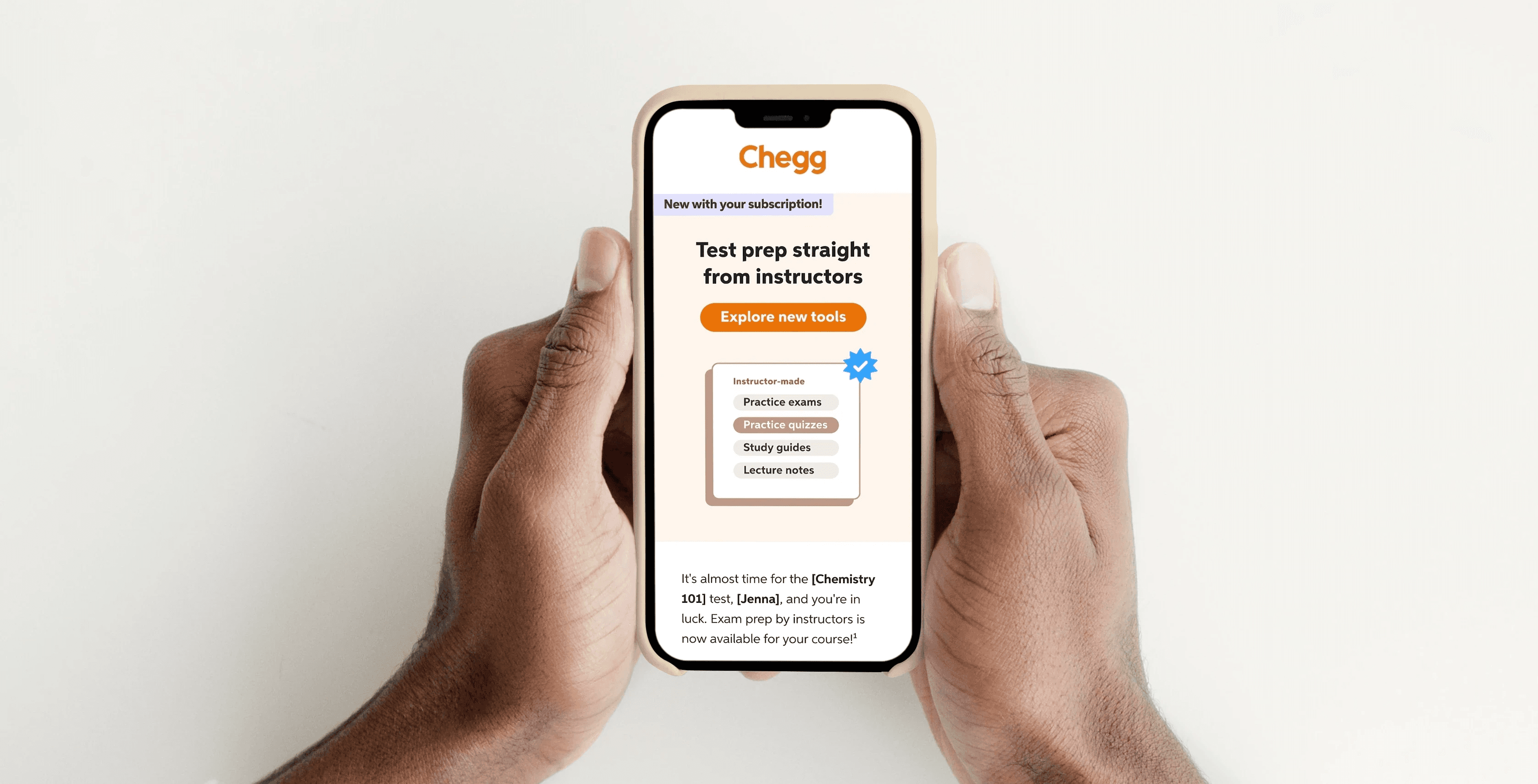
Outcome
Through strategic design and a focus on user experience, we transformed the product cards into an engaging tool that effectively showcases our offerings. This overhaul improved comprehension, increased engagement, and streamlined conversion paths.
Through strategic design and a focus on user experience, we transformed the product cards into an engaging tool that effectively showcases our offerings. This overhaul improved comprehension, increased engagement, and streamlined conversion paths.
Through strategic design and a focus on user experience, we transformed the product cards into an engaging tool that effectively showcases our offerings. This overhaul improved comprehension, increased engagement, and streamlined conversion paths.